Personal finance infographics
Money decisions are easier when the maths is visible. These personal finance infographics explain the ideas behind everyday choices, such as how compound interest snowballs over time, how a SIP differs from investing a lump sum, and which habits move your credit score up or down.
Many examples use Indian rupees and Indian institutions, but the principles apply anywhere. Numbers on each graphic are either calculated with the formula shown on the page or taken from official sources such as regulators and credit bureaus, which are listed in full.
These graphics are for learning, not advice: they explain how things work so you can ask better questions, compare options and read the fine print with confidence. For decisions about your own money, speak to a SEBI-registered adviser. Teachers and trainers are welcome to use them in financial-literacy sessions, with credit to InfoGraphHub.
All Finance infographics (3)
 Finance
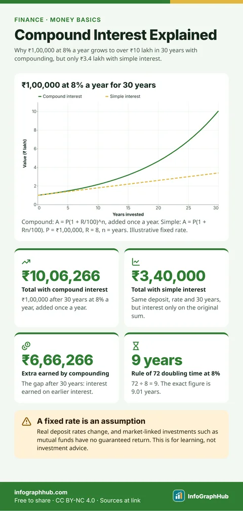
Compound Interest Explained: How Money Grows Over Time
Compound interest is interest earned on your interest. Each year’s interest is added to the balance, so the next year’s interest is worked out on a bigger sum. Over long periods this makes money grow far faster than simple interest.
 Finance
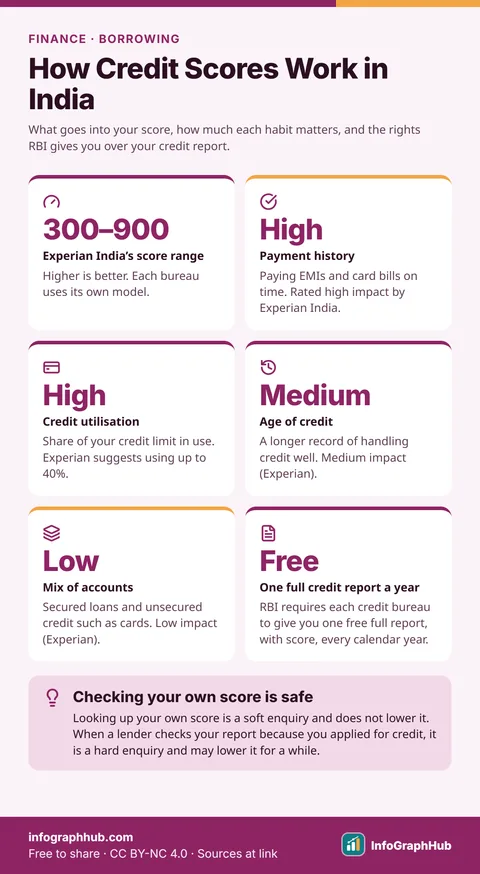
How Credit Scores Work in India: What Moves Your Score
A credit score is a three-digit number, such as Experian India’s 300–900 score, built from your borrowing record. Paying on time and using little of your credit limit matter most; the age and mix of your accounts matter less.
 Finance
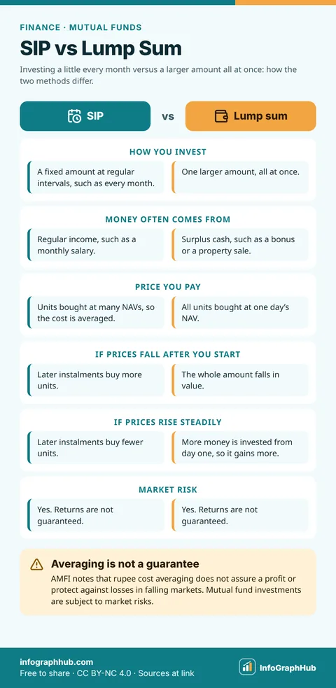
SIP vs Lump Sum: Two Ways to Invest in Mutual Funds
An SIP puts a fixed amount into a mutual fund at regular intervals, so you buy units at many different prices. A lump sum invests one larger amount at once, at a single price. Neither is always better, and neither guarantees a return.
Frequently asked questions
Is this financial advice?
No. These infographics explain general concepts for education only. Please consult a SEBI-registered investment adviser before making financial decisions.
Where do the numbers come from?
Worked examples are calculated with the formula shown on the page. Facts about rules or scores come from regulators, credit bureaus and other official sources listed on each page.
Can I use these in a financial-literacy workshop?
Yes, for non-commercial workshops and classes. Keep the credit line and link back to InfoGraphHub, as required by the CC BY-NC 4.0 license.